- cross-posted to:
- lemmy@lm.korako.me
- cross-posted to:
- lemmy@lm.korako.me
Last update: 2024/07/18 21:20
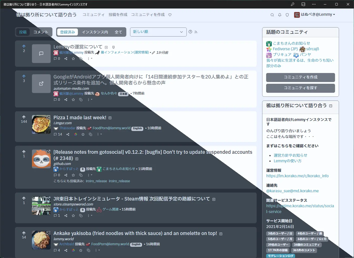
Lemmy/PieFed用のUserStylesを試作した
GitHubにあったlemmy-ui/src/assets/css/themes/nord.cssを整形したものをベースに作った
Bootstrap 4.6.2 5.3.3のscssからコンパイルしたのでサーバー側にも導入できるかも
You must log in or register to comment.
次回アップデート予告
.btn-group-toggle {
  border-radius: 0.5rem !important;
  background-color: var(--hlt-secondary);
  background-image: none;
  padding: 0.25rem 0;
}

.btn-group-toggle .btn-outline-secondary {
  margin: 0 0.25rem;
  border-radius: 0.5rem !important;
  color: var(--hlt-white);
  background-color: transparent;
  border-color: transparent;
  padding-bottom: 0;
}

.btn-group-toggle .btn-outline-secondary.disabled,
.btn-group-toggle .btn-outline-secondary:disabled {
  color: var(--hlt-gray-dark) !important;
  background-color: var(--hlt-secondary) !important;
}

.btn-group-toggle .btn-outline-secondary.active,
.btn-group-toggle .btn-outline-secondary:active {
  color: var(--hlt-primary) !important;
  background-color: var(--hlt-white) !important;
  background-image: linear-gradient(0deg, var(--hb-post-background), var(--hb-post-background)) !important;
}

.btn-group-toggle .btn-outline-secondary:focus:not(.active):not(:active),
.btn-group-toggle .btn-outline-secondary:hover:not(.active):not(:active) {
  color: var(--hlt-secondary) !important;
  background-color: var(--hlt-white) !important;
}

@media (prefers-color-scheme: dark) {
  .btn-group-toggle {
    background-color: transparent;
    background-image: linear-gradient(0deg, var(--hb-post-background), var(--hb-post-background));
  }

  .btn-group-toggle .btn-outline-secondary.active,
  .btn-group-toggle .btn-outline-secondary:active {
    background-color: var(--hlt-black) !important;
    border-color: var(--hlt-black) !important;
    background-image: none !important;
  }

  .btn-group-toggle .btn-outline-secondary:focus:not(.active):not(:active),
  .btn-group-toggle .btn-outline-secondary:hover:not(.active):not(:active) {
    color: var(--hlt-white) !important;
    background-color: var(--hlt-secondary) !important;
  }
}