

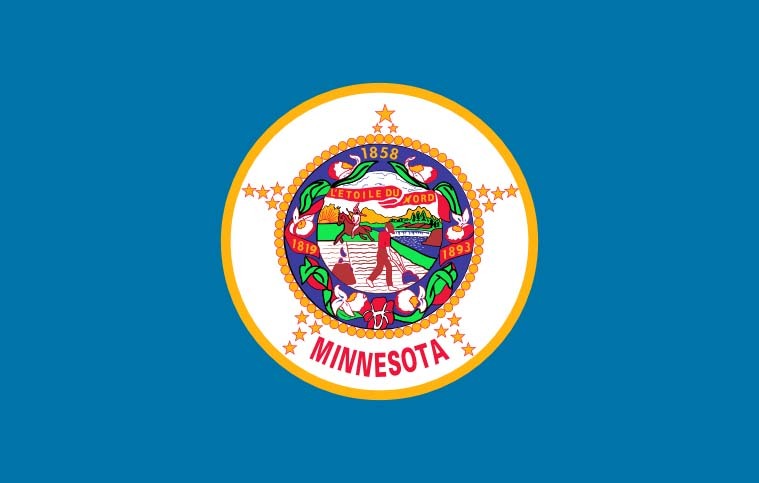
Minnesota’s new state flag should feature an eight-pointed North Star against a dark blue background shaped like the state, with a solid light blue field at the right, a special commission decided Tuesday as it picked a replacement for an older design that many Native Americans considered offensive.
The State Emblems Redesign Commission chose the final version on an 11-1 vote after finalizing a new state seal that depicts a loon, the state bird. Unless the Legislature rejects them, the new flag and seal will automatically become official April 1, 2024, when Minnesota observes Statehood Day.
The star echoes Minnesota’s state motto of “Star of the North.” The commission’s chairman, Luis Fitch, said that to him, the light blue represents the Mississippi River, “the most important river in the United States,” pointing to the North Star. But he acknowledged it could mean other things to other people. Symmetry and simplicity won out over other versions, including ones that included a green stripe for the state’s agricultural heritage.
Seems to be that Minnesota was better off with its previous flag.
It’s worse than the original design with the white/green/blue tri-colour on the right.
But still a big improvement.
B2 - Blue, white, green, with the same star - should have won, imo. But I don’t live in the state, so my opinion is irrelevant.
They’ll be changing it again within a few election cycles, this looks terrible.
Nah, its styled in the generic internet vexilogical circlejerk style and will look dated as soon as the hivemind moves on to the next current thing.
You’re nuts. That flag is a banger.
I don’t even know what Minnesota’s flag looked like.
Uh, no one is going to miss that.
Don’t worry, Republican legislators are already in frothing rage about the change. I’m sure it has nothing to do with them wanting to keep the problematic imagery in the current one of native Americans being driven off their land. /s
Also they’re spreading some conspiracy theory the new flag is supposed to look like the flag of Somalia or something and that this is a prelude to Sharia law being imposed. I wish I was joking. Yeah, because it has blue colors and a star in it, it must be an homage to Somalia, couldn’t have anything to do with being the “land of 10,000 lakes” and “the north star state.” Or even the old flag, which get this, is blue with a big star in it.
I also liked the version with the stripes better, but this is very nice too, and anything is better than the atrocious current one. The new seal with the loon is very nice too.
Other states that just lazily slapped their seals on to a blue background take note and get to fixing them up please.
No that was the tricolor variation that preceded this final design, and it actually did look like a Somalia flag. I think this one will be pretty well liked by pretty much everyone. The only people who won’t like it will instinctively not like it because of the taint of wokeness as a motive to change it. Whatever. But at the end of the day, it was a trash flag and everyone will ultimately agree that it’s better now.
Libtard snowflakes don’t even know what a seal looks like. It sure ain’t looks like a bird, I tell ya
But loons are half bird/half seal with bitchin’ red eyes.
That is a terrible flag even without the racism. A good flag should be clearly identifiable as an emoji or at least a stamp.
Racism aside, it’s like an ugly Christmas sweater in flag form.
I love it when someone can verbalize my feelings perfectly.
Cool flag. I like the solid light blue over the stripes that were an option, K.I.S.S…
Feel like with that simplified they could have done something with color a little more interesting than the dark blue to really emphasize the shape of that dark blue region but if you can’t give this a 10/10 your standards are too high.
The new one suffers from aluminimalism whereas the old one looks like something my mom would stick to the fridge with magnets to show how proud she was of my work in fifth grade that I spent all Thanksgiving afternoon working on by myself.
What the hell happened to the star‽ They took away its twinkley starriness. Now it just looks like a blurry circle
As a Texan, I approve of this design.
This is a great choice. That flag is probably now the best one in the Union.