
You must log in or register to comment.
I’d be really interested to see how Japan and South Korea are in comparison. Those 2 countries have had an ongoing birth rate crisis for a little bit now.
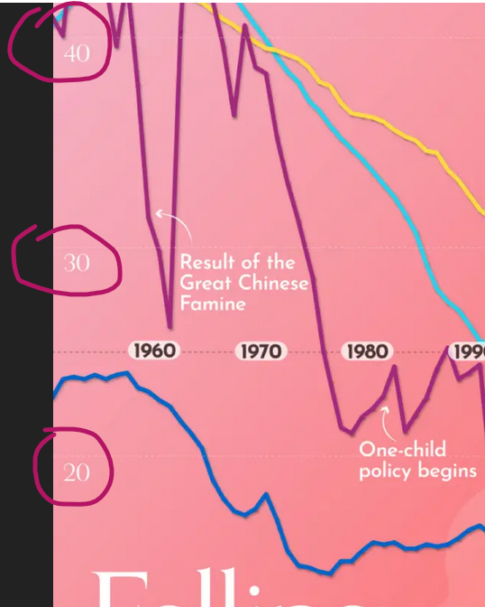
Did some googling. Japan looks to be at about 7.5 and South Korea at 6.9. They’d be real low on this graph
Y axis labels are for the pigeons!
I mean they do label it, just over on the right side of the graph instead of the usual left
Are you guys looking at a cropped version, or is it just too light to see?
But what are those units? What do they mean? It’s labelled on one of the lines rather than the actual axis which is unusual to say the least.
