- cross-posted to:
- linux@kbin.social
- cross-posted to:
- linux@kbin.social
Poll on the KDE Discourse to vote between the finalists, the three most voted options will be passed on to the Plasma developers for their consideration. The poll will last for one week.
https://discuss.kde.org/t/plasma-6-logo-final-selection-and-poll/8001
You must log in or register to comment.
I think they should’ve done a community contest like for the wallpaper. But even more I think Plasma (or more in general KDE) should work on brand identity first and decide a clear, original and distinct logo / wallpaper / whatever style.
@linucs
For me, they did “the cube thing” -again- and i like it. It’s what brought me to linux in the first place: boasting to my friends that i could do this and that, and they couldnt.
Lost a few fights, around compatibility and reach.
But hell yeah do i love that damned cubed desktop come back around: moar kiddos, moar future. And feel more hopeful about the curre t state of open source when the mass discovers it because its kewl.
@NiaTheCat
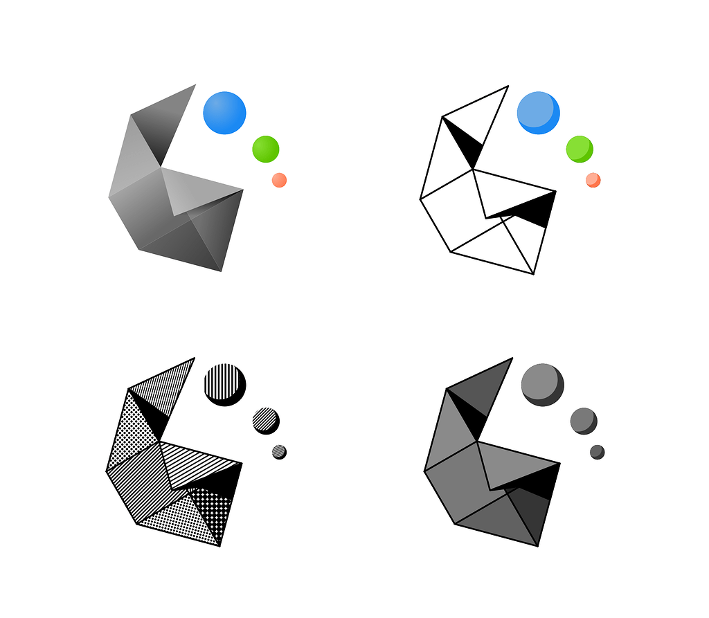
I think I vote the bottom right “thingy”.
But I also like the grey and black fold. (Bottom right).
I don’t like the gear logo.
6 is already coming? It feels like it was only yesterday when 5 was announced. I’m seriously getting old…
Could anyone give a brief rundown of the changes since 4? I really tried to like it but just couldn’t. How’s 5 compared to 4? And is there a preview version of 6 available yet?
And is there a preview version of 6 available yet?
You can try it on KDE Neon if you want something already packaged up.
info
I voted for the “Half Gear” because I always loved that design, but I gotta admit that the Triangles look pretty cool and a bit more modern.
Half gear is the only good looking one. The rest look too generic.
I don’t really dig any of these personally but bottom left looks goood if I had to choose
What if we don’t like any of those?
So I’m the only one vibing with the fold?..ight
Please remember the poll is non-binding. The devs are under no obligation of changing the log if non of the proposals live up to their standards. The selected logos are just suggestions for them to consider. Nothing more.
Thingy and Triangles look great, but the gear could have been made better. I wouldn’t have voted for it anyway, because KDE should stay easy to differentiate from Plasma.
My vote goes to Thingy.