

I plan to play my preview of Ironsworn: Sundered Isles this weekend and you bet your ass that the OG Captain Morgan graphic is going to be one of the NPCs at some point.
Good NPC (mentor?) or boss fight?
Ok I’m in a waiting room super bored so forgive my ridiculous takes, but the second one is probably a better logo even if the design is worse in a bunch of ways.
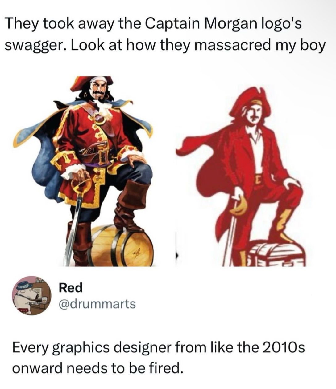
So, first lets look at Morgan as a brand. It’s a known brand, but not exactly top shelf stuff. From what I can find, they seem to be trying to change that, moving into the ready-to-drink and doing a bunch of social media stuff. they’ve moved from using artificial vanilla flavor to real *Madagascar vanilla* which is definitely more marketable no matter if it actually tastes better or not.
So as part of that they’ve redesigned basically all their labels and that means they need vibe with the modern upmarket design trends which right now are to use more type and negative space, and to ape design from the era around the 50s and maybe 60s. It goes with the current retro packaging design trend but doesn’t alienate older people like the 70s based stuff, which is usually aimed at a younger market segment. It’s old enough to feel “classy” even if the customer is old.
As part of that, the large illustration doesn’t fit. Printing full color like that in the era it’s aping was expensive so it feels out of place, and you just don’t have space for it if you want a clean look. So it’s got to be way smaller. The old label has the illustration as basically the main focal point - it’s huge. The new one has it as a small design point. The illustration just doesn’t work at that size. On a little 50ml bottle it’s going to be like 4mm high. Here’s a photo I found.
The new one actually reads pretty similar even though it’s like half as tall and only uses 2 colors. When it’s on a bottle that small and sitting next to Admiral Nelson and Lady Bligh which still use big full color illustratons on their labels can you tell which one is which?
But here’s the thing, the captain isn’t even actually the logo. The logo is the name, it’s the same logotype. They didn’t change that. They changed the mascot. It’s pretty important to note that there’s a big difference. A logo basically is your branding. It needs to work at any size, in any medium, and be instantly recognizable. That generally means it needs to be pretty simple. The Morgan logotype works great as a logo, but the mascot until now really didn’t. You can tell because if you look around there are about 50 different versions because the big full color illustration doesn’t work more often than it does. The new one will.
With all that defense I will say there are a few kind of dumb moves. The treasure chest is clearly a terrible idea. Like, if they were swapping it in on the non-alcoholic lines it would be kind of great but on everything it’s dumb. And I definitely would have fought for a puffy shirt instead of the collared one, if nothing else than for historical accuracy - I don’t think you can even wear shirts if the era unbuttoned with a collar like that.
Anyway, I keep seeing this take over and over again, that everything is moving to minimalist blobs for logos, and while sometimes there’s definitely a point (the cross branding for Google’s apps on Android come to mind) a lot of the time there done just like this - with two large copies next to each other. And when you frame it like that of course the detailed one will look better. But when your logo has to shrink to 32x32px on a crappy Android phone or be printed like 5mm wide in black and white the simpler one is going to look way better.
Anyway thanks for coming to my Ted talk I guess.
Tldr: the guy isn’t the logo he’s the mascot and the new one can be printed small.
This is all true. But he still looks like David Arquette instead of Dustin Hoffman’s Hook. They could have retained his swagger even with a simplified look.
It’s really just that he looks depressed now. Shoulders back, hips forward, and it’s 100% better.
I wonder if people are getting that impression since it’s a normal 7 or 8 heads tall now instead of 9 which is what the old one looks like. Making it closer to a normal human would make sense if there’s aiming for cosplay / self-insert type marketing. The more I think about it the more im willing to bet that’s the angle.
Well clearly these designers aren’t familiar with the Master Chief. 8 foot tall super soldier, self insert.
Not a rum drinker. I have no history with this brand.
If I had the choice of the two in the store, I would pick the new design.
The new mascot looks so much worse on the small bottle IMO.
It’s only better as a logo because it’s a vector image and can be printed on everything. It’s worse in every other way, and they could have vectorized the original Captain without making him a narrow shouldered dweeb.
The bottle on the right looks more fun. I’d rather drink that one.
Fewer colors also makes it easier to reproduce in mediums where there’s a per-color expense, like shirts, embroidery, etc and works better when converted to greyscale. Keeping the same look across all merchandise is good.
Excellent breakdown.
We found one lads, quick grab him before he slips back into the art cave
This guy either rums or markets. Maybe both. Possible pirate and/or parrot and sabre enthusiast.

This you?

No but you could probably sell that at like the arts and crafts fair, to maybe some POWs, or like somebody’s dad…
I’m somebody’s dad! I’ll take 3 please. And a painting of Trogdor
I really dislike the collar shirt. I, too, suspect cosplay encouragement, but it really ruins the scallywag vibe
Tbh I’m going to continue buying The Kraken anyway, because Krakens are awesome.
Why would we stand for this. Take the streets. Bring your green hat.
Old boy is about to pop open that keg and have a great time with the guys.
New dude is pondering investment plans to maximise return on investment from that treasure chest.
This is the definitive proof that money doesn’t bring happiness.
Went from a pirate to a port town customs agent
New dude is grinning and hoping to be forgiven for showing up late to his niece’s sixth birthday party.
When you loose access to your 1000+ hour account and have to start over.
Who drinks this shit anyways?
Poor captain. The light is no longer burning inside him, but defiantly he stands.
Is that a cape, or a piece of cloth stuck to his back? It looks so weird.
It’s a “kick me” sign.
How will I know this is saucy sauce if the cap isn’t looking saucy? Frankly dangerous.
This is why I prefer Admiral Nelson’s rum.
Also because it’s quite a bit cheaper.
Definitely a lower quality rum though.
Kraken if you want something a little better, or Sailor Jerry if you’re looking for something comparable in quality.
Though none of them are what I would call “premium”
I’m mostly looking to get drunk for as little money as possible
Calico Jack – different and sadly shittier historical figure, but the rum is damned drinkable for the price.
less ink colors when printing. they are pinching pennies everywhere to deliver more profits.
But did they have to make him pose like a misanthropic and unsatisfied middle manager who has been forced to have a souvenir photo taken at some local “pirate island” park in order to try and prove that deep down they’re fun in the company newsletter that no-one reads?
Why did they turn him into the Tampa Bay Mascot Bucco Bruce?
Checking the important things - Sailor Jerry looks like it’s still the same. Can’t tell if the pinup girl is still on the inside of the label though.
Everyone else has done the in-depth design analysis already, so I’m gonna say what’s really on my mind:
They made him less fuckable. I would never put the new Captain Morgan logo on my “hall pass” list.
Best analysis in the thread.
It’s the shitty contagion of Flat design. Back around 10 years ago or so, the Flat craze began and everything that had details or depth was pounded down into simple flat design. Now everything has to look basic and boring, and it sucks.
Even within that idiom, it sucks. His face is clearly-expressed through one dark blob - but it’s not a good face, or even a good expression. His jacket was opened for contrast… when it was already lined down the middle, for contrast. The line no longer conveys a barrel-chested manly man.
His hand gripping the pommel like a cane is a sign this was either nitpicked to death or done badly on purpose as a cry for help.
Art Institute really fucked us there. They taught “color by numbers”. Instead of teaching students how to make unique creations, they constantly hammered in “well this is what the corporate world wants right now”. What was “good” was creatively devoid and could be made by following a checklist. Had an ex who changed their entire art style, persona, and had business cards made up of some hexagon style because “hexagons are all the rage right now!”. Business card looked like something a beekeeper would hand you, not a graphic designer.
This doesn’t have anything to do with flat design. It’s the fact that people take hammers and look at everything as a nail and go pounding things. Everything like this is a “contagion”, people just latch onto hot button ideas and go crazy. Flat design in itself is fine, and extremely beneficial for what it was designed for, it’s just overused because people chase trends.
Before flat it was skeumorphism and that was even worse. You had everything in tech trying to look like real things which made things way too busy and hard to read. And then people tried to make it work on tiny phones with low res displays and it was difficult to use.
Hence, flat design was born as a solution. It made icons easy to read on tiny devices. And it did a good job at that. It solved a problem and did it well and everything was well and good.
The problem was the next step where people decided they needed “consistent branding” so they did it on their website too. And then their marketing materials. And then their products. Then you had a problem.
Flat design works well for what it was made for: iconography. And for legibility of small UI. But it’s not for everything. But people can’t think for themselves and solve different problems in different ways. And Google made it easily available everywhere. And people picked that up and use it everywhere. And THAT is the problem.
I think flat design makes sense for logos too, for the exact same reason it makes sense for icons. Flat logos are easier to recognize and see, especially from far away.
I’m not saying this logo great or anything but I don’t think it’s fair to claim that everyone using flat design is just a trend chaser.
I’d argue that designers don’t even understand why they use Flat design in ui’s. The purpose, as you said, is to reduce clutter. However designers don’t understand this and remove all context from all UI elements. What is interactive and what is static is no longer discernable.
I’m writing this in Thunder and nothing in Thunder’s UI shows any distinction between text that is interactive and text that is only text. You have to click the screen at random to see what happens.
Because of this, I’d argue that Skewmorphism is better because we have had 10 years of bad UI showing that designers do not know how to apply Flat design principles.
Skewmorphism is like garbage collection for programmers. A programming language doesn’t need it and is faster without it but too many programmers for too long have shown they can’t be trusted to write clean code.
I’d agree with everything you say about designers choosing to use flat designs without understanding the point. It’s definitely overdone and this becomes a problem.
But your argument for skeuomorphism is a huge stretch. We had ten years of skeuomorphism also showing it just straight doesn’t work in a lot of places. It becomes overloaded and hard to read.
But you’re comparing it to absolute off the deep end applications of the opposite. Why not somewhere in the middle? The entire argument you make for it is just that “well people understood what was click able etc” which is literally just basic design principles and nothing to do with skeuomorphism uniquely.
Why can’t we just expect UX people to do their jobs correctly? Why throw the baby out with the bath water in order to get a different baby we know has other issues?
We had ten years of skeuomorphism also showing it just straight doesn’t work in a lot of places.
We had 30 years of skeuomorphism starting with the Mac in 1984 and it always worked although suboptimal. Flat can be better but when not done right it’s worse than skeu. I personally would rather have a UI that is more cluttered but always discoverable over a UI that isn’t always obvious.
We can’t expect UX people to do their jobs in the same way we can’t expect programmers to do their job correctly.
I really like the simplicity of flat design. It makes things easier to find and recognize, especially for icons. Also easier for people with poor eyesight. It caught on for a reason.
Lemmy loves to shit on designers but there’s no way the designer had the autonomy to come up with this on their own. 100% guaranteed this idea came from marketing or an executive.
I don’t like flat design because it’s basic, boring, and sad. Windows 10 and 8 were ugly flat boring UIs for example. IMO peak GUI design was Mac OS X 10.6 like this:
Full skeuomorphism out the ass
Windows XP’s Fisher-Price design and OG iPhone lickable buttons were an excess we should have learned from instead of dumping altogether. It’s like music software started getting skins that were as non-rectangular as possible, and the whole industry went no, that’s silly, let’s stop.
Now you look at Windows 10 and it’s not even clear which parts of a window are connected. Windows friggin’ 95 had drop-shadows and relief shading. Why do modern OSs need to look like a Kraftwerk album?
It’s so that ten years down the line they can sell us detailed stuff as some sort of innovation again.


