

I have to navigate an interface like this to access resources from my school and it jams my brain. I don’t know if it’s badly designed but my brain doesn’t know what to click or where to point my eyes when I’m looking for something. I literally have to read each element, visualize what the words represent, and compare it to a visualisation of the thing I’m looking for to guess what I need to click on which proves to be very cognitively straining. I know it sounds pathetically simple but it is an additional dopamine hurdle I have to overcome before I can do any homework or revision. I don’t have this problem on most webpages. I wonder whether it could be ADHD related because my classmates always seem to find relevant resources in the system for things that I turn to Google for because this page is so impermeable.
Here’s another example:
You must log in or register to comment.
It hurts, why?
Frankly, that interface is dreadful.
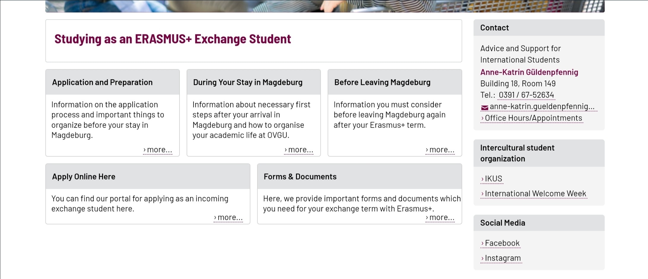
Is that blackboard? worst experience i’ve ever had, that interface actively detracts from learning because its so confusing. Our school recently ditched it due to student feedback.
Oh good so it’s not just me. Yes that is Blackboard
Most modern UIs are shit, and not just for people with ADHD.
The biggest sins IMO:
- Everyone has to be unique, instead of sticking to established and successful design patterns. *Breaking existing UI elements (looking at you, infinite scroll).
- Trying to do everything, all at once.
- Not getting rid of old shit (hello Microsoft).
God damn Microsoft why the fuck do you have two versions of outlook and teams what the fuck is wrong with you.
Why can’t I break teams channels out into a window, why are your alerts so fucking bad. How does shifts in teams not have the option to make a reoccurring schedule. Why is this garbage afterthought of a program what powers every corporation
Two? Colleague from our IT team reckons it’s more like six.
New Teams has more options for opening new windows, but it’s also more stubbornly determined to open docs in the web app (embedded within Teams of course).
Shifts is a straight no for my team. And don’t get me started on Planner…
Please tell me what you use for an alternative to shifts I am on a one man mission to replace it
Fuck this whole eco system it’s so terrible. It’s what made me switch to Linux at home.
What beats me is how people like to say how 90s’ webpages looked horrible. But when I get to a miraculously still functional webpage with 90s’ web design, I feel like I’m walking in a park. Then I get to something such people would call a normal webpage, and I can’t use it. I ask such people and they … are not interested in actually finding something in the pile of crap they call better.
This is because its all old and straight to the point. No caveats, no javascript bs, no huge buttons or long loading shit, no css that moves shit around or doesnt work on that one machine with a certain resolution.
It. Just. Works.
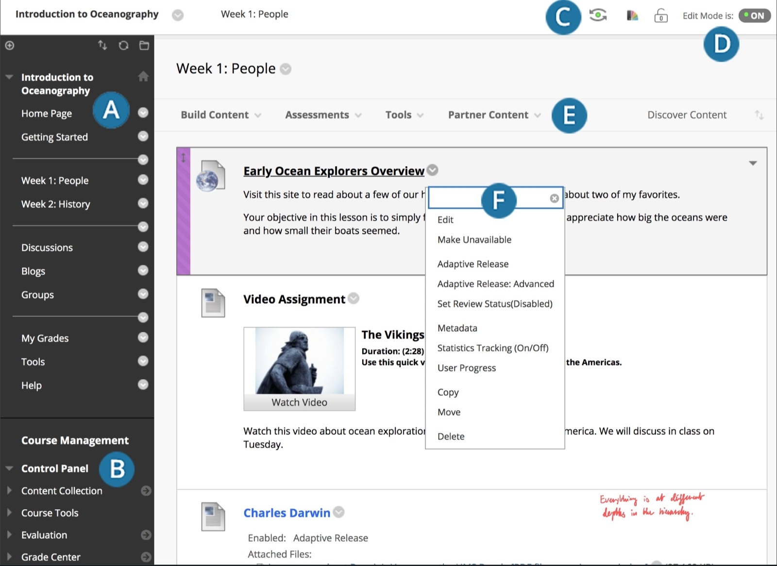
I’m a college professor that uses BB and try to make things as easy to access as possible. The same assignments and information can be found in multiple places in the course, i avoid using the jankiest Blackboard applications, I set things up so that text is visible without having to click through another link, etc. But BlackBoard doesn’t make it easy. We’re switching to Blackboard Ultra this Fall, which I think does have some improvements, especially in the UI department, but I’m doubtful it’ll be much better.

