
ThatOneKirbyMain2568
- 84 Posts
- 120 Comments
 0·4 months ago
From what I can gather, this particular design was proposed by Puerto Rico’s New Progressive Party (Partido Nuevo Progresista or PNP), which advocates for Puerto Rican statehood. The circle definitely has its appeal, though I think I’d prefer something closer to the current flag.
 0·4 months ago
@Advocate I think the slabs may be a technical limitation. They’d have to deal with every combination of top & bottom slab, which might involve tons of new blockstates or an overhaul of how slabs were handled and thus not be very feasible when they have other things to work on.
Or it might be another vertical slabs thing where they say it “liMitS CreAtIViTY”.
Fair point. I’ll loosen up the rules some.
 0·5 months ago
Maybe home-grown human intelligence (HGHI)?
The Northern Territory has what’s probably my favorite Australian flag. Idk, that shade of brown is just really cool. It’s like candy.
I want to eat the flag.
 0·5 months ago
…Who exactly is asking for this? AI chatbots are cool and all, but I have no idea why you’d want them in your messages app. What would you even need that for?
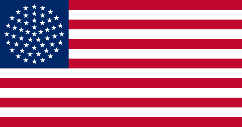
When I was going through redesigning all of the U.S. state flags, this is one of the first designs I made. Here’s the symbolism:
-
The colors are reminiscent of the orange, white, & blue pattern used in many of New York’s state flag.
- The blue has been replaced with the purple of the Iroquois flag.
-
The white shape in the center holds several meanings.
- It resembles a crown to represent New York being the Empire State.
- It points upward to represent New York’s motto: “Excelsior” (“Higher”).
- It looks somewhat like tall skyscrapers because duh.
-
While I’m never a fan of coats of arms on flags — displaying the coat of arms is what, well, the coat of arms is for — this is actually pretty solid. The background is a Scottish flag with swapped colors, which makes sense given the province literally being called “New Scotland”, and the royal arms use a small set of colors that go well with the rest of the flag.
Since I already like Rhode Island’s flag a lot, I didn’t want to go too far from the original design. I decided to make the following three changes:
- The background was changed from white to blue. I felt yellow on blue popped a lot more due to the higher contrast, and it helps a lot with the nautical vibe.
- The “HOPE” ribbon was removed. It’s fine, but I prefer the flag without it.
- The ratio was changed from 29:33 (🤮) to 1:1 to match maritime signal flags.

 0·6 months ago
I think there are a few culprits here.
-
Not everything wants to be an everything app. While everything in the fediverse uses ActivityPub, that doesn’t mean everything has to aim to be interoperable. I wrote a lengthy rant about this here, but essentially, it’s important to have things with a more specific, restricted purpose if we want the fediverse to be accessible. If someone just wants a thread aggreegator (i.e., just Reddit’s style of media), they shouldn’t be forced to grapple with microblogging features more fit for a Twitter-like. There are some platforms that aim to combine different media types—Kbin/Mbin has both thread aggregation and microblogging, and I’ve heard that Friendica tries to work well with everything. Even so, if someone wants federated Reddit, they should be able to have federated Reddit, and Lemmy aims to provide that. The same way that Pixelfed (an image-sharing platform like Instagram) doesn’t need to incorporate Reddit-style threads or Twitter-style microblogs, Lemmy doesn’t have to do it all.
-
Federation is still in the works. Something to keep in mind is that most of these platforms are early in development and still working out a lot of bugs. Kbin (the platform I use) is an obvious example due to its currently incredibly spotty microblog federation (tho I’ve heard that Mbin has implemented fixes to fare better in this regard). We have to be patient while all the kinks are worked out. As much as we all wish it didn’t, software development takes time—a lot of it.
-
Admins can sometimes be a bit trigger-happy with defederation. I don’t think the fediverse has quite grasped that defederation is essentially the nuclear bomb of instance moderation tools, cutting off interaction with all users of an instance. While there are times where this is justified (even preemptively, such with Threads imo), there are times where the nuke has been threatened over a quarrel between admins or disagreements about other defederations. Hopefully, this will cool down as the fediverse matures, but we’ll have to see how that pans out (especially with Threads federation growing ever nearer).
-
This flag was used by the Great Socialist People’s Libyan Arab Jamahiriya. As you can see, it has a very intricate design rich with symbolism.
Fun fact: The escutcheon (shield) of the Jamahiriya’s coat of arms is similarly detailed.


Continuing with the trend of vexillological organizations having their own flags, the Flag Society of Australia has one. While the flag within the flag looks really cool and has a nice color palette, I think the flag as a whole looks a bit odd. The Southern Cross looks weird since its stars are crowded closer together but not shrunken themselves, and the arrangement of everything just doesn’t work imo.

But you see, they did it with triangles.
Explanation for anyone who wants it: https://explainxkcd.com/wiki/index.php/2878:_Supernova
@Pamasich @ernest Can confirm that this is an issue. I brought attention to it a short while back, and there are also some bugs with the visuals for vote buttons not consistently working as they should.

 0·6 months ago
Yeah, English “sh” (which, yes, is [ʃ]) is a really nice sound. In general, I like fricatives and affricates made in that general area of the mouth.
In response to your side noteː
- [] is phonetic transcription, used for exact sounds. For example, I say the English words “kin” and “skin” like [kʰɪn] and [skɪn]. This transcription can vary between dialects. For example, I say Latin like [læʔn̩], whereas someone else might say it like [latʰɪn].
- // is for phonemic transcription, used for phonemes. A phoneme is sort of a set of sounds that distinguishes words from each other. For example, “cat” and “bat” are seperated by the phonemes /k/ and /b/. You can’t swap the consonants without changing the meaning, so they’re said to be distinct phonemes. A phoneme can have several different realizations — for example, /k/ can be [k] like in “skin” or [kʰ] like in “kin” — but these variants aren’t used to distinguish words. Thus, they’re said to be allophones of a single phoneme.
As for resources, I don’t fully remember how I went about learning IPA, but I’d recommend these old videos by Artifexian on place of articulation, manner of articulation, and voicing (the three main elements of any consonant in the IPA), as well as his video on vowels.
Hmm, I imagine you wouldn’t need to. For your example, just using the tuoproximal demonstrative (i.e., that near-you book) would imply that the book is far away from the speaker — otherwise, they would’ve used the omniproximal. I could see two being used for emphasis though.
Mine is probably [ɬ]. From the moment I learned about it, I thought it was a super satisfying sound, though I haven’t used it in the conlang I’m currently tinkering with (Hip’alŭk’). However, I’ve recently gained a strong liking for [ç], which is in Hip’alŭk’ as an allophone of /h/ (in fact, it’s in the name: [çiˈɸalʊkʰ]).
While I think it’d be cool to have skeletons spawn more right near fossils, I don’t think increasing skeleton spawning in a single chunk would make it easier to find them. Skeletons spawn all over the place, and I doubt you’d be able to pinpoint a chunk where more skeletons came from than usual. You might be too close to the chunk for them to spawn there anyway. A solution might be to massively increase skeleton spawning in a several-chunk-large area around fossils, but that would probably confuse players who don’t know about the easter egg.
I think it’d be best to just have skeletons spawn at fossils in order to make them more interesting, not really to make them easier to find. If you want the latter, you could just make them more common.
Yeah, the one with alternating rows is the one I see most and the one I’d prefer. You make a good point about the circle being different though. Honestly never thought about it that way, but with that in mind, I can see why the PNP would opt for something like this.