
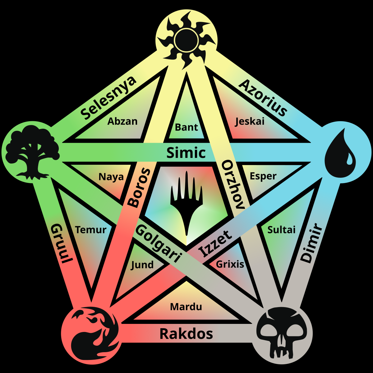
New take on the color pie, hopefully easier to read.
You must log in or register to comment.
I was thinking while looking at the earlier version that background gradients would make it easier to read. This is indeed an improvement.
I like this one much better than the original colour pie that was posted here, this one’s much easier to read and more intuitive <3
Yeah, this finally clarifies where the terms shard and wedge come from for me!
This is awesome! Great work on this, super useful reference
Thanks!

